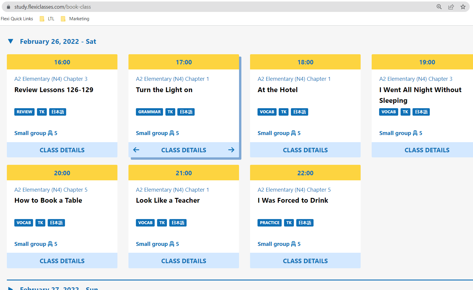
We made a small change in the way class cards are displayed. There are now two lines for topic names, so in case a topic name is long and needs two lines (or your display is just really small), there is a 2nd line to continue in without having to make the class card longer than others and then the whole thing looking ugly because some class cards are longer than others.
Not sure if anyone noticed, but I know it has been bugging some users @Max All feedback welcome.
5 Likes
Looks great!
1 Like
Definitely an improvement. Thanks!
1 Like