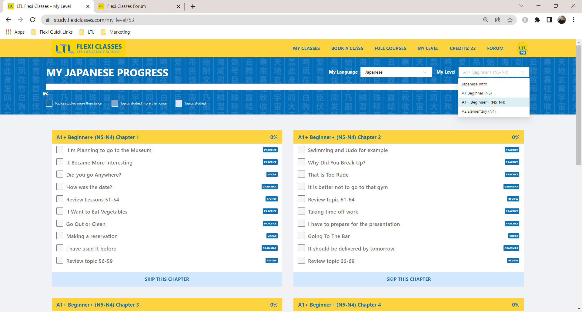
We had some complaints about the boxes where we display the language level not being big enough anymore, as some language levels for example in Japanese have pretty long names. We include the Japanese N1-6, The European A1-C2 and an English description of it to make sure everyone knows what it means, but that leads to a long name. Same for Korean.
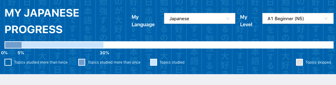
We made the boxes bigger now so you can always see the full level name both on mobile and PC.
Please have a look and let me know if you like it or would like anything changed.
1 Like
Nice, much better! Thanks.
It’s not exactly aligned for me (Firefox browser on Macbook Pro), but it’s not an issue as such, just an aesthetic thing!
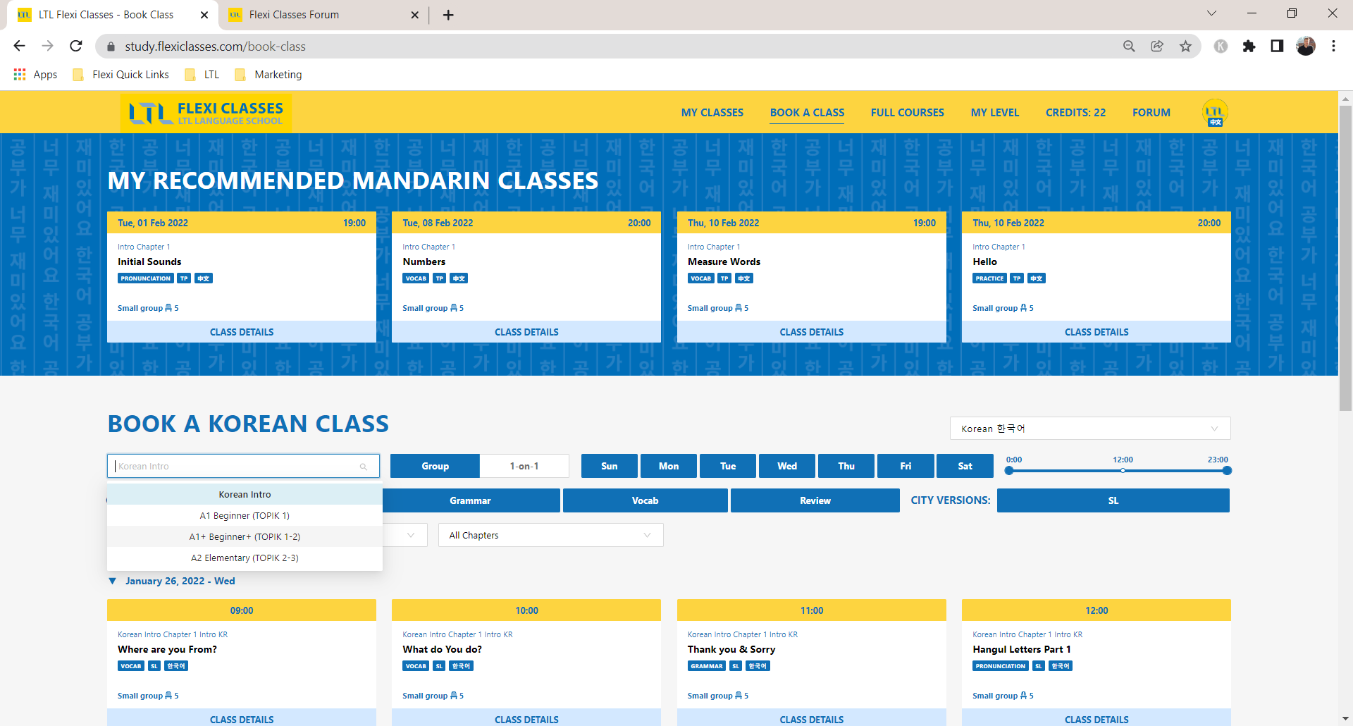
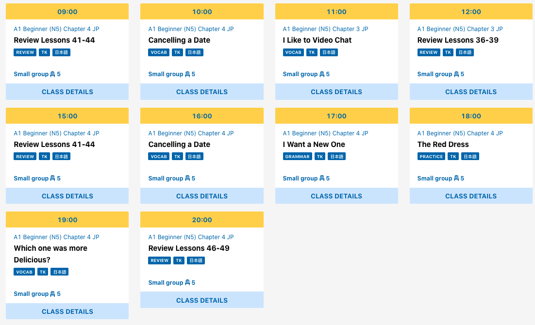
My next picky request is to have all class boxes the same size so we don’t get annoying indentations. This comes from class names being a little longer than others. See the bottom left one here.
1 Like
Thanks, we will fix the alignment thing, thanks a lot for the feedback!
For the class cards, the issue are too long topic names. Alternatively we would only display a part of the topic name in the card which I think would be even more annoying?
That would be more annoying.
I would perhaps find a way to extend all the boxes to two lines (even if it only reads one line). That way they are all uniform.
Just my thoughts anyway.
1 Like